help is appreciated
obed maps
-
tehWastedJamacan

- Vidmaster
- Posts: 1347
- Joined: May 17th '09, 16:24
- Location: SuFu, SD
- Contact:
any obed users (or forge i guess) have any tips on making a map that looks good? like, the do's and dont's of obed/map creation in general?
help is appreciated![[MGrin]](./images/smilies/11.png "marathon")
help is appreciated
D?rovací tvá?í.
Fobo: I find it hard to keep a sentence down under two paragraphs.
-
L'howon

- Vidmaster
- Posts: 898
- Joined: Mar 18th '08, 12:49
- Location: Somewhere outside the Citadel Of Antiquity
- Contact:
While not obvious, the "Search" button will probably help you quite a bit. I suggest you use it first before posting questions.tehWastedJamacan wrote:any obed users (or forge i guess) have any tips on making a map that looks good? like, the do's and dont's of obed/map creation in general?
help is appreciated
I have been wading in a long river and my feet are wet.
-
$lave
Your best bet right now would probably be to try making a few maps and posting them here for feedback. Starting with simple netmaps would be best. The list of things you can do would be enourmous, but if I have time I can try to compile a list of things which (I think) look bad.
Two main, seemingly obvious things which are overlooked by possibly every mapper initially, however, are proper texturing and lighting. Mainly, don't leve anything at light 0, and make sure the lighting is differential enough that not only can you tell all sides from eachother, but so you can also distinguish the various areas of a map from eachother. I don't have time right now, but if you want I can try to help you later.
Two main, seemingly obvious things which are overlooked by possibly every mapper initially, however, are proper texturing and lighting. Mainly, don't leve anything at light 0, and make sure the lighting is differential enough that not only can you tell all sides from eachother, but so you can also distinguish the various areas of a map from eachother. I don't have time right now, but if you want I can try to help you later.
-
tehWastedJamacan
- Vidmaster
- Posts: 1347
- Joined: May 17th '09, 16:24
- Location: SuFu, SD
- Contact:
alright, here are some maps i have made previous... hope you can help
ignore the creatures, it was for a physic i was working on
also, im working on an arena-like level, and I have some stadium "seats" made, but a wall sticks up becus they are directly above teh exit of one of the rooms
here is the map
*UPDATED*
ignore the creatures, it was for a physic i was working on
also, im working on an arena-like level, and I have some stadium "seats" made, but a wall sticks up becus they are directly above teh exit of one of the rooms
here is the map
*UPDATED*
Last edited by tehWastedJamacan on May 22nd '09, 03:16, edited 1 time in total.
D?rovací tvá?í.
Fobo: I find it hard to keep a sentence down under two paragraphs.
-
tehWastedJamacan
- Vidmaster
- Posts: 1347
- Joined: May 17th '09, 16:24
- Location: SuFu, SD
- Contact:
also, how do i make teh walls that have blue(transparent) show the polygon behind it. Or is that not how it works?
D?rovací tvá?í.
Fobo: I find it hard to keep a sentence down under two paragraphs.
-
$lave
Sorry, been a bit busy, but I'll try and give you some more advice tonight or tomorrow.
Not sure how you place transparent textures in Obed, but in visual mode lua if (while viewing the map) you click second trigger, it should switch to texturing "transparent" sides.
Anyway, a lot of things factor into making a map look good, some of which are:
-Architecture
-Lighting
-Texturing
-Detail
Architecture and "detail" are in some ways basically the same thing, but what I mean specifically by architecture deals more with "large" scale details, while "detail" in itself implies smaller things. For examle, adding a polygon along a hallway to serve as an indent in the wall, often with a light texture, would be a "detail", where architecture could refer to having hill shapes in a floral design. This takes practice, however, and until you're more comfortable with actual map designs I'd stick to adding details, and ignore large scale architecture.
Level design can also effect how your map looks, but is even more important than that. A good map will flow well (no dead ends, slow platforms, headbangers) and generally focus on one main area, or a few areas which the players can easily access from eachother. Having a map with two large arenas connected by one long hallway is a bad idea, as the combat will be spread across two hard to access areas. Ideally players will always be able to find someone to kill within a few seconds of spawning, but without an excessive risk of being "spawnkilled".
Lighting and texturing are crucial to a good looking map; many maps have failed by going for large and complex architecture and doing a poor job of lighting or texturing the area. While a map shouldn't look too repetitive (don't use one texture for an entire area), alternating textures with every wall looks choppy and ugly.
Lighting is even more often overlooked, but can really make or break a map. Bright, open areas often look messy and unappealing, but good shading can take awhile to get used to. I prefer not to use any lights under light 5 (about 75%, I believe) for anything but lights. As I said before, also try not to have walls which are not paralell to eachother have a light within 2 shades (10%) of eachother, ideally around 4 shades different on walls at 90º angles.
I'd suggest running around Red Spectrum by RyokoTK and looking at how the maps are designed, what sort of details he's added, how the maps are textured, what sort of lighting there is etc. It takes practice, but your mapping should start to improve fairly quickly if you keep at it! Also, make sure to check the checklist pinned in this forum, it has a lot of good/bad things to check for in your maps.
Sorry this isn't terribly well written, but I don't have the time or attention span to really go through it and make sure it's coherent right now, but hopefully it's understandable
-
tehWastedJamacan
- Vidmaster
- Posts: 1347
- Joined: May 17th '09, 16:24
- Location: SuFu, SD
- Contact:
k $lave, thanks.
also, if anyone wants to help, feel free to offer any other tips and your thoughts about my maps above.
also, if anyone wants to help, feel free to offer any other tips and your thoughts about my maps above.
Last edited by tehWastedJamacan on May 23rd '09, 01:27, edited 1 time in total.
D?rovací tvá?í.
Fobo: I find it hard to keep a sentence down under two paragraphs.
-
tehWastedJamacan
- Vidmaster
- Posts: 1347
- Joined: May 17th '09, 16:24
- Location: SuFu, SD
- Contact:
bump
D?rovací tvá?í.
Fobo: I find it hard to keep a sentence down under two paragraphs.
-
MoppyPuppy
- Vidmaster
- Posts: 1232
- Joined: Jan 22nd '06, 18:27
- Location: Lake Nebagamon, WI
- Contact:
TIP: Draw the level on a scratch sheet of paper first. Erase and Rewrite until its just perfect.
Also, I'm no fan of Marathon Evil's SUPER backtracking method to making levels long and tedious. But you should have backtracking to areas to complete objectives to a limited extent so a level isn't too short.
WARNING: Backtracking, as in; battle your way to a chip, battle your way to the chip insertion, battle back through newly opened doors, battle to the main objective, battle back to leave. Something like that.
Backtracking, NOT as in; battle your way toward a chip, but then get slaughtered in cheap "teleport behind you" ambushes, then backtrack to the ONE recharger in the level at the start. Level repeats this process in each new room. That is not game play, that is just work.
-
Shadowbreaker
- Vidmaster
- Posts: 3436
- Joined: Jan 22nd '06, 18:56
- Contact:
Drawing maps is really stupid and time consuming, IMO. I'm aware how primitive Obed's polygon filling is, but really a lot of maps were just laid out as they were made.

The dont's of mapmaking is to avoid the really bad stuff:
bouncy polygons
polygons that gets the player stuck
trapping the player
too much monsters and too little ammo
slow elevators and doors in netmaps
horrible texture placement (e.g. door textures as floors)
The dos of mapmaking is to do create things you do enjoy. Ya know, get your own style.
On lighting you have to experiment yourself. Imo, all mapmakers will not agree on ideal lighting.
Me, Im a big fan of lights 0, 7 , 10 , 12 , 15 , 17 , and 20. For 90 degree angles I use these pairs:
0:10
7:12
10:15
12:17
15:20
Drawing the map on paper first has advantages and disadvantages:
+ it's faster than to skecth in an editor
- you can't check out what the architecture reallylooks like, so some things you draw may end up looking ugly.
- it's easy to mismatch distances. On the paper you may think that's a big enough room, but in the editor it turns out way smaller than you had imagined.
Last edited by goran on May 26th '09, 10:22, edited 1 time in total.
I checked your arena map, and it looks typical noob. We've all been there I think. My first maps looked like that too.
At this point feedback may help, but I think you just need to map a lot and get comfortable with the editor, heights, ligths
and textures.
Also, please check out the sheepsaver download in the emulator section. Forge is a much better editor than obed.
At this point feedback may help, but I think you just need to map a lot and get comfortable with the editor, heights, ligths
and textures.
Also, please check out the sheepsaver download in the emulator section. Forge is a much better editor than obed.
Last edited by goran on May 26th '09, 10:32, edited 1 time in total.
-
Lawstiker

- Cyborg
- Posts: 95
- Joined: May 22nd '09, 18:50
- Location: Somewhere in the Sol System
- Contact:
I think it depends on the mapper. Some mappers are good at just opening the program and just start creating a map, were others may need a base design to start off there maps. I do agree that to create complete maps on paper may be time consuming and not really effective (Just as goran said, your not sure how it will actually look in the visual mode), but it can be effective if you are somewhere were you don't have a computer handy (EX: School) and come up with a map design.Shadowbreaker wrote:Drawing maps is really stupid and time consuming, IMO. I'm aware how primitive Obed's polygon filling is, but really a lot of maps were just laid out as they were made.
-
tehWastedJamacan
- Vidmaster
- Posts: 1347
- Joined: May 17th '09, 16:24
- Location: SuFu, SD
- Contact:
goran, i have NO CLUE whatsoever about what you are talking about... im guessing the lighting is forge stuff... The lighting in obed is from 0 - 65500 (or sumthing like that...)
D?rovací tvá?í.
Fobo: I find it hard to keep a sentence down under two paragraphs.
In forge there's 20 standard ligths.
0 is 100%light
1 is 95% light
7 is 65% light
10 is 50% light
20 is 0% light
As you can see there's a 5% difference between every number. Hope this helps you understand.
0 is 100%light
1 is 95% light
7 is 65% light
10 is 50% light
20 is 0% light
As you can see there's a 5% difference between every number. Hope this helps you understand.
-
MoppyPuppy
- Vidmaster
- Posts: 1232
- Joined: Jan 22nd '06, 18:27
- Location: Lake Nebagamon, WI
- Contact:
Here is the ultimate don't.
If your not an artist, or don't know one, take all your thoughts about new monsters and throw them away.
Just give up.
No one will help you, and if they do, you'll get something really half-ass compared to what they would have made for themselves.
Its what kills scenarios.
If your not an artist, or don't know one, take all your thoughts about new monsters and throw them away.
Just give up.
No one will help you, and if they do, you'll get something really half-ass compared to what they would have made for themselves.
Its what kills scenarios.
-
tehWastedJamacan
- Vidmaster
- Posts: 1347
- Joined: May 17th '09, 16:24
- Location: SuFu, SD
- Contact:
@goran: hehe, 65500 or whatever it is, is like 100%, and 0 is 0%
@moppy: i dont plan on making monsters, just maps.
@moppy: i dont plan on making monsters, just maps.
D?rovací tvá?í.
Fobo: I find it hard to keep a sentence down under two paragraphs.
-
tehWastedJamacan
- Vidmaster
- Posts: 1347
- Joined: May 17th '09, 16:24
- Location: SuFu, SD
- Contact:
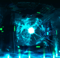
so i scrapped my arena map, although i would still like to see how to get rid of that wall, Lawstiker, and began a new solo map. I only have 3 polygons, so I would like your opinion on the walls and floor. Do they match up well? The green wall is where i will add on more polygons.
BBCode:
BBCode:
D?rovací tvá?í.
Fobo: I find it hard to keep a sentence down under two paragraphs.